Why I Struggled Painting My First Orthodox Icon
Icons vs illustrations
If I ever talk to you about the art I create for Creative Orthodox, I’d always start with “the illustrations I do aren’t icons”. I sometimes go the extra mile to skip halos to really get the point across. This difference is always present in my mind as I draw knowing that I’m both untrained and that the result will always be “lesser” than an icon. Now whether that thought is right, wrong or neither, is a different story. It’s just what I had in mind going into my 10-week icon class.
Our iconography teacher: Symeon
I won’t do Symeon’s work justice, you can read about it here and on his own site. In short, he knows the ins and outs of Orthodox iconography. He creates his own boards, collects and processes various pigments from natural local sources (Ontario, Canada), and raises the hens that give the eggs he uses to bind the pigments. He knows how to turn a little pebble into glorious red hues and a (to my untrained eye) ubiquitous plant into deep browns. You can imagine how foreign this is to me, a digital illustrator. I’m as disconnected as an artist can be from the traditional iconographer’s method (but still use black ink and a metal quill on paper, so I got that going for me! :D).
Throughout the 10 weeks, a group of 11 congregation members attempted to learn from Symeon how to paint his take on Christ the Pantocrator icon.
The struggle is real
What makes an icon? I’ve thought about this question for quite some time! As a start, though, most elements of an icon have to be purposeful. This is the common thread I’ve found through a number of Iconography books. Plus, most modern Orthodox icons carry simple uniform lines and a certain “cleanliness” to their brushwork. The figure is drawn a certain way, the colours are picked for certain reasons, and the expression is drawn to convey a certain emotion. These vary between styles (Byzantine, Coptic, Ethiopian…etc.). Everything in the icon comes together to present a portal into the heavenly. Here’s the thing, though; my illustration style is the exact opposite! I read a desert father or mother, try to understand their character from their stories, sit down with my brush and ink, and just see where it takes me!
The Pantocrator
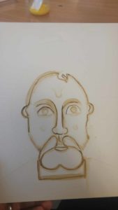
Outlining Christ’s face in ochre
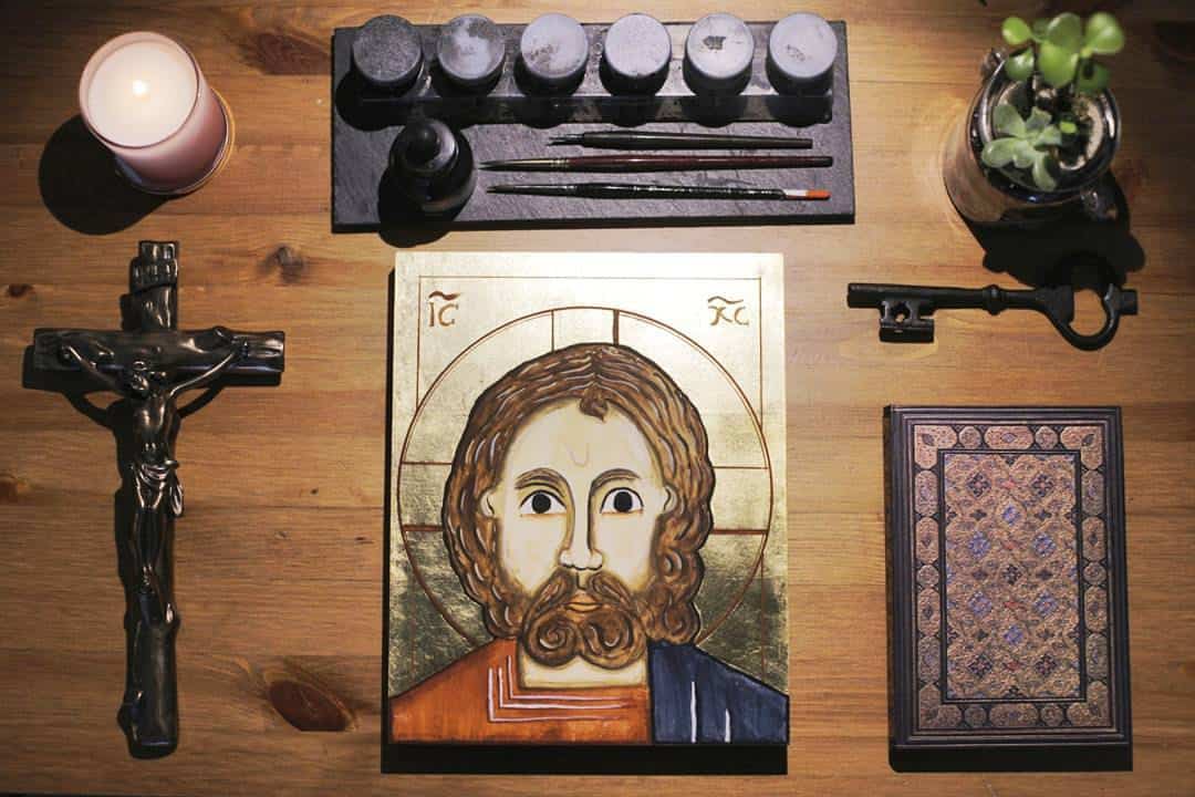
For our Pantocrator icon, we made sure to plan every step of the way. We sketched it first in pencils, etched it into the board, outlined it once, coloured in the skin and hair, outlined it again, coloured in some shadows, did colour washes and more outlines. Stating and restating lines. I was slowly driven to insanity, this was the exact opposite of how I’m used to paint, and my icon gave that away.
My wife, on the other hand was having an easier time yielding closer results. She likes to measure, follow instructions and practice before putting a brush to the icon. Halfway through the course I was giving up.
My lines were too short, gradients too rough and the icon looked very “different”. I started asking Symeon how do we dispose of it! (FYI, burning. We don’t throw icons out, we burn them!) and I was ready to do it.
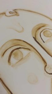
I was too concerned with my outlines (that are now covered with paint!) to see and think that theres a lot more work that will transform the icon further on.
I learned there that we don’t always have to see “the big picture” to keep working at overcoming difficulties in life – be it a literal icon, a spiritual drought or a worldly challenge. I was too concerned with my outlines (that are now covered with paint!) to see and think that theres a lot more work that will transform the icon further on.
Having just finished the icon last week, I’m left with a huge sigh of relief. It’s not my favourite out of the class output, but I don’t disdain it either! I gave it to my father as a gift, and will definitely work on icon writing again in the very near future.
