
Lettering My Graphic Novel
My lettering process
Here’s a little progress shot of my lettering process. I usually have a pretty good idea of how the page looks when I’m penciling it on paper, but oddly enough it ends up looking totally different in the end. I scan my inks and load them into Photoshop to start cleaning up the page and getting it ready for lettering.

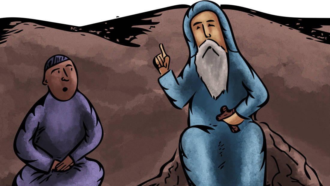
In the graphic novel medium, the words are just as a big part of the art as the drawings are. I also like to play around with framing and where the lines are leading the eye. For this certain page I’m actually not too happy with how it ended up being but I’m kind of forcing this layout on myself. I like the frame with the tree so I wanted it to be large but that also means it won’t be harmonious with the frame on its left. Actually, now that I write and think about it I think I’m going to change it. Right. Now.
Framing in graphic novels
On a separate but kind of related note, I started reading the Amulet series by Kazu Kibuishi this week and I really like the pacing and framing. Specifically, I like how the frames have little variation yet each one has its own character, the frames are also sort-of hand drawn (straight lines with little jagged pencil marks). I even like how the colorists chose to sometimes let the color overflow out of the frame and didn’t limit themselves to it (check the picture for reference, look closely at the third panel, it’s a little hard to see in a picture).This framing method in graphic novels is really good as it makes it really easy to follow and read while still giving each frame its own character and look. For my own graphic novel I’d say I’m playing with fire as I don’t regularly follow grids and often let the drawings mix and mesh into each other. Looks nice- but sometimes makes it really tough to follow!